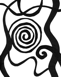
For this project, we had to make 4 distinct designs by cutting up a 4" square and using all the pieces. We had to make two nonobjective, one abstract, and one design that still retained the essence of the square that we had cut up and then reassembled. We had to completely destroy the square so that the viewer couldn't realize that that's what we had originally worked from.
 This was my first design that I made. When I started to think about the different ways that I could destroy the 4” square that I was working with I started thinking about the branches on a tree. I was at home, and it was a beautiful fall day outside and I took that inspiration and began cutting. Originally when I started laying out the pieces for this abstract design, I was thinking of a tree during fall losing its leaves. I wanted the leaves to be blowing in the breeze to connect the piece and creatively move the viewer’s eye throughout the work. It wasn’t until I started gluing down the pieces meant to be leaves that I realized that it looked like it was the outline of a tree full of leaves in spring. I felt very accomplished with this work that I had achieved so much more than I had originally started out with.
 I used abutting with the ground pieces and mutual tension a lot through the leaves and frame of the tree to avoid scattershot.


